BK Interiors: Molly Torres’ Prospect Heights Apartment is Breezy and Eclectic
PHOTOGRAPHY Ira Yousey
SUBJECT: Molly Torres
NEIGHBORHOOD: Prospect Heights
OCCUPATION: Interior Designer for Homepolish
LIVED IN RESIDENCE: 5 months
NUMBER OF ROOMS: Five (Open Kitchen/Living Room, Bedroom, Office, Two Bathrooms)
ROOMMATES: Fiancé (Harry Portnof of Greenway Records)
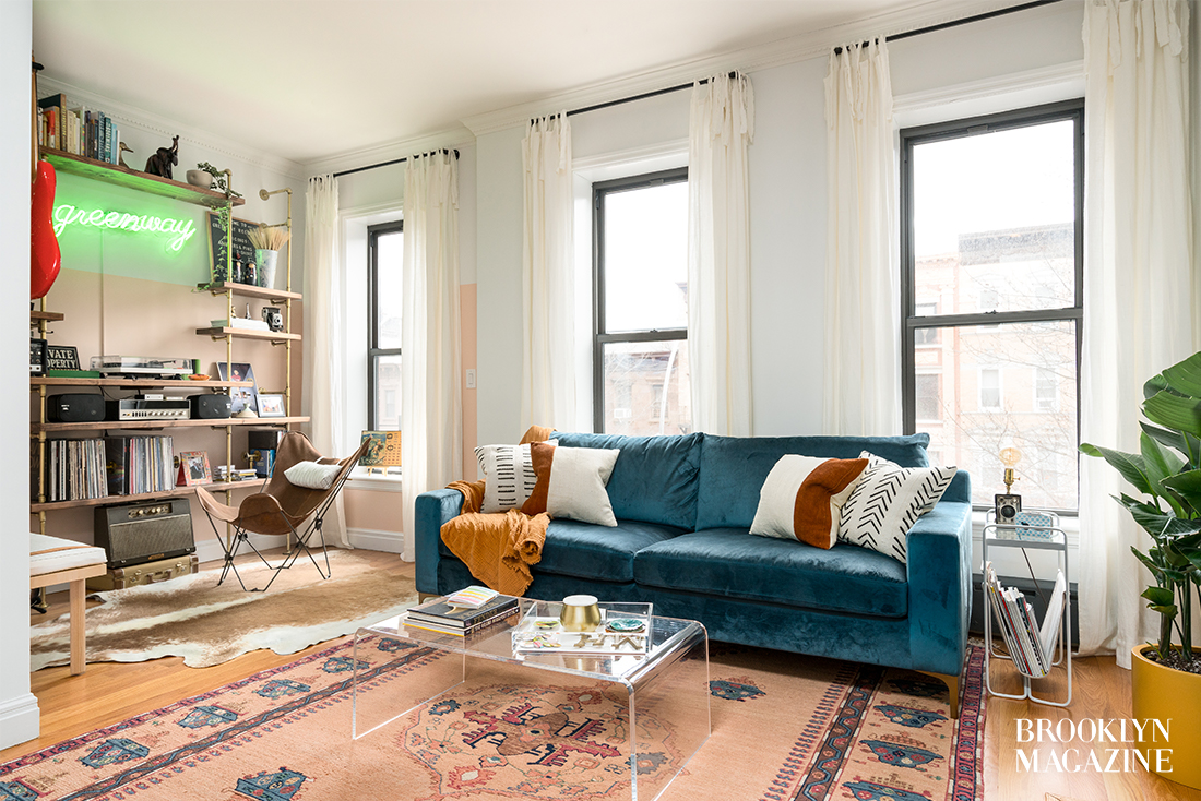
When I stepped into Molly’s apartment, I was swathed in bright natural light and greeted by a cheery grin. Having met Molly and her fiancé once before, the apartment seemed a natural reflection of who each of them is as a person. A mix of bright colors, neutral tones, lots of textures and plenty of comfy seating, the apartment felt like somewhere I wanted to make myself comfortable and stay for hours discussing audio culture and neighborhood haunts.

What’s your favorite thing about your apartment?
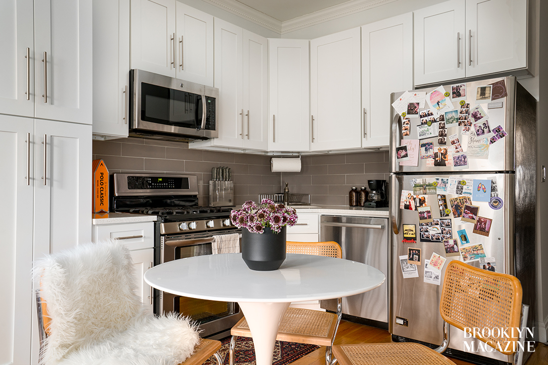
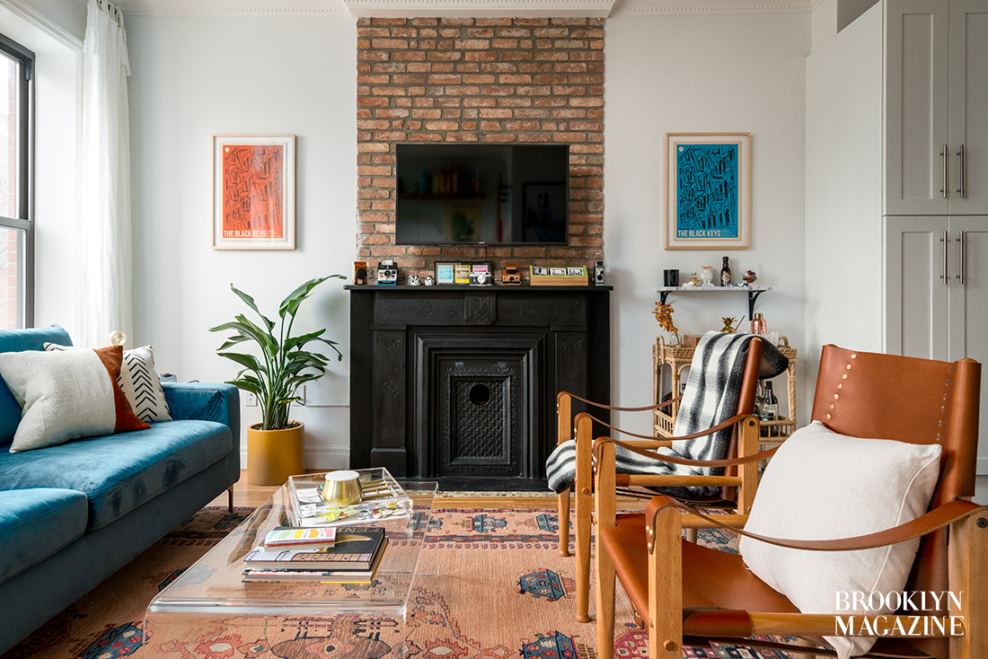
It’s too hard to land on just one favorite thing! When we decided to move to Brooklyn, we had lots of high hopes and I had long list of must-haves. By the end of our search, we were beaten down by the apartment hunting process and that’s when we finally lucked upon our current place. Recently renovated, high ceilings, tons of natural light, a fireplace (non-working, but an incredible architectural detail), hardwood floors, brick wall, two full bathrooms (a relationship game-changer), washer/dryer in unit… I love it all!
Least favorite?
No true entryway and lack of closet space.
What’s your favorite thing about your neighborhood?
The fact that it feels like a neighborhood! We’ve lived in a few different areas in NYC, but nothing compares to the amount of space, trees and puppies (SO many puppies) in Prospect Heights. I’ve always wanted to live in a brownstone and living in one that’s steps from Prospect Park, a ton of great restaurants, other beautiful neighborhoods like Fort Green and Park Slope and tons of subways is really a dream come true.
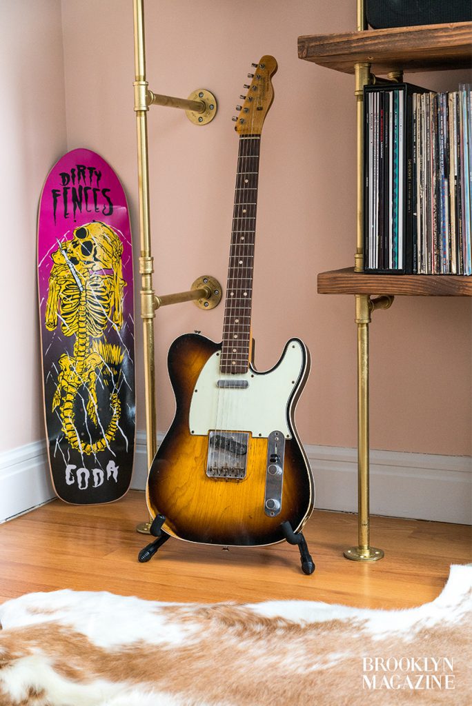

I’m majorly inspired by “California casual,” Moroccan and Spanish styles and have a huge crush on all things Australian design. I’m big on layering and textures and my personal style is a bit of a fusion between clean and considered and pops of color and whimsy. While I’m serious about the design process, I never want anything I design to feel too serious! Between Harry’s vintage guitar, musical gear, camera and concert poster collections and my hoard of colorful vintage rugs, there’s a lot of prettiness and fun to ogle in our space. The biggest compliment is when a friend or family member tells me our home “feels” like us.
What has been the biggest challenge about styling the apartment?
After living in a studio apartment with Harry for four years, the fact that we actually have rooms (plural) is pretty incredible. The only downside to more space is that we had a LOT of space to fill on a budget. I won’t lie – we blew through our budget, but I tried to concentrate on incorporating investment pieces that not only look great in this space but will look great and function in any future home we move into. The custom Soil & Oak bookshelf was an exception because I’m not too sure how transportable it’ll really be. But it was totally worth the splurge since it’s a clear focal point and I was able to design it to suit our storage and display needs.

About how long did it take to get the apartment to look “complete”? What did the process look like for you?
To start, it’ll never, ever be “complete!” How easy Harry’s life would be if it was. I get restless and like to change things up from season-to-season (usually small things like throw pillows and other decorative accessories) and since I’m constantly gathering inspiration, designing, sourcing and decorating for clients, it’s super hard not to come up with new ideas for my own space. The great thing about designing for myself is that I have the luxury of time – there’s no rush and the deadlines are my own. Because of that, I really tried to live in our apartment for a while before making big decisions and I’m still holding off on some, like a new coffee table. As for process, I’m big on Pinterest boards, space plans and presentation boards and definitely implemented all three for this apartment. After five months, we’re finally at a place where it feels done-ish.
Do you have a funny story to tell about the space?
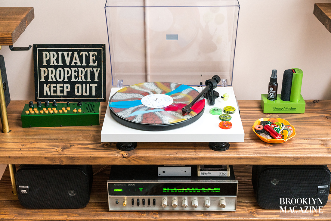
I created the “music area” in our living room as an homage to Harry- essentially his very own “man cave” where parts of his collections are on major display. Even though he loves how it turned out, he hates when I touch his guitars… and his records… and his cameras… and come to think of it, anything of his. But as the designer (and as his future wife), I enjoy taking liberties!
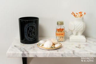

Furnishing and decorating can seem daunting, especially in a rental like ours, because you have to strike the right balance of making it “yours,” while also realizing it’s an impermanent home. Focus on small changes with big impacts, like updating light fixtures. Whether it’s a meaningful print or just something you enjoy looking at, utilize affordable online framing services like Framebridge and Simply Framed to bring some life to your walls. I’m also a sucker for rugs; besides being kind to your feet, they visually define areas in an open space. For example, the cowhide rug helps section off the “music area” of our Living Room, while the vintage Persian rug delineates the “main area.” Last, try to mix it up! No one wants their home to feel like a West Elm showroom, so find a happy medium between big box stores and custom or vintage pieces from places like Etsy while sourcing.
What does your dream apartment look like?
A mix between any home Amber Lewis (of Amber Interiors) has ever designed and a prewar, Italianate-style townhouse with tons of ornamentation and moldings.
What’s one thing that every apartment should have?
Plants! Even succulents. Greenery’s a great way to make an apartment feel lived-in and homey.
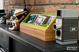

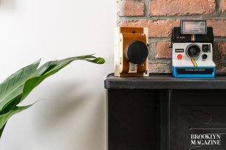
Since we have 10+ vintage cameras on display, we started a little tradition in our last place that’s carried over into our new home: taking a Polaroid picture of every person that comes to visit. If you squint a little, you’ll see Morgan’s Polaroid in the detail shot of our Polaroid holder.
Enjoy Molly Torres’ apartment tour below!
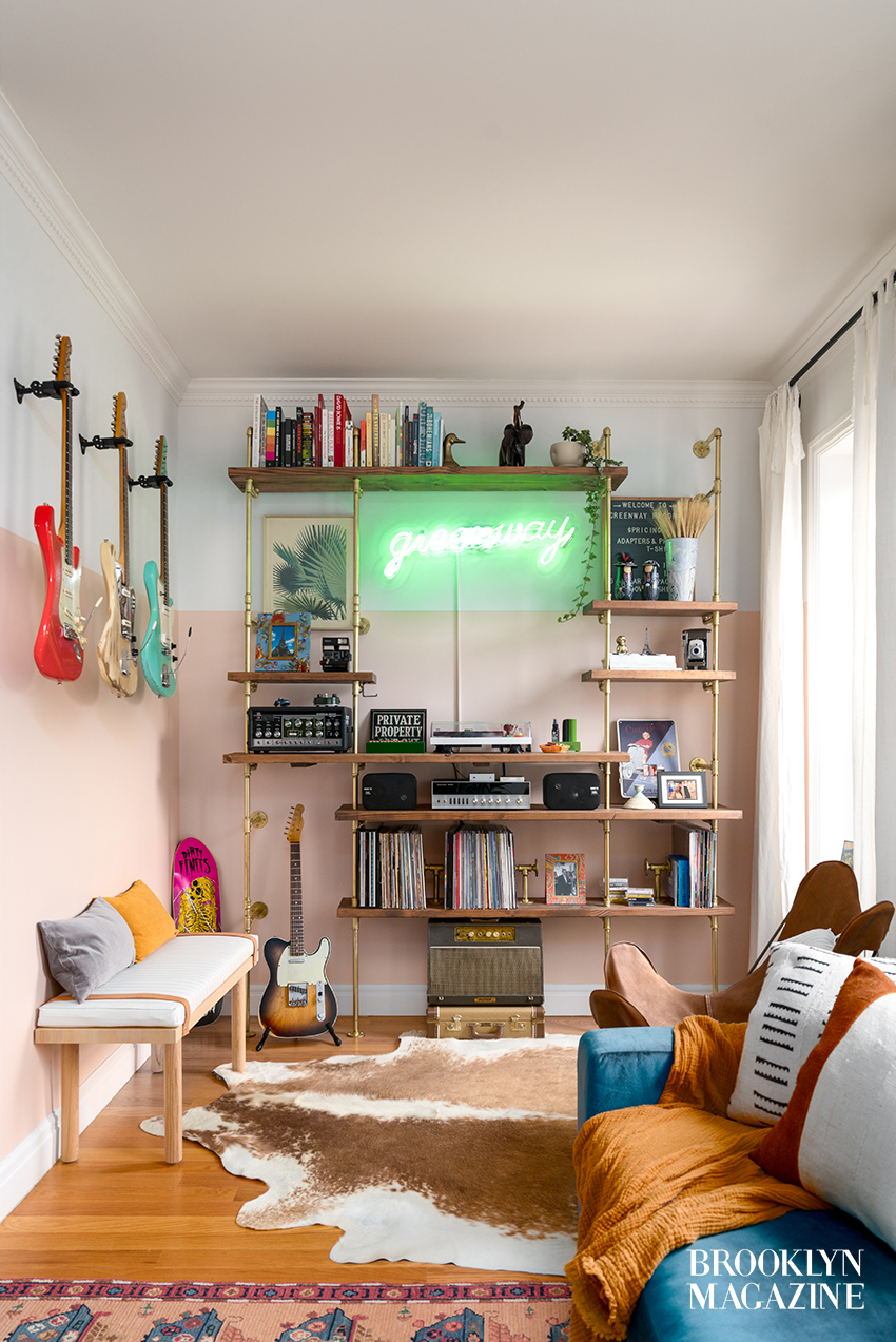

Harry’s music corner with a custom bookshelf by Soil & Oak and a custom neon sign by Endeavour Neon. Cowhide rug from Cowhides for Less; butterfly chair from Urban Outfitters; custom bench & butterfly chair cushions from Stitchroom; Palm Print from Matters of Space.
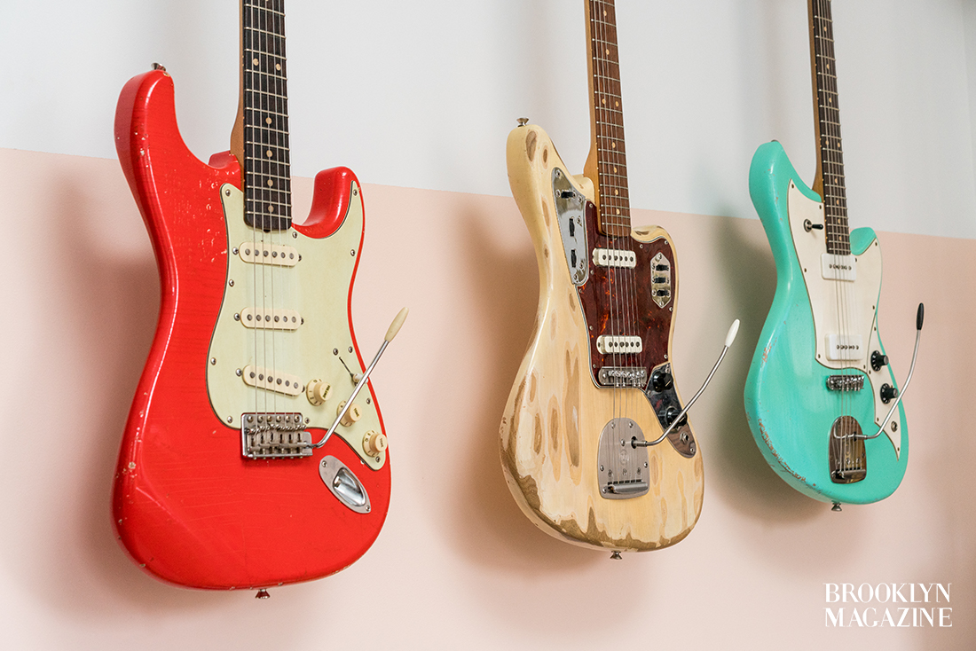

Harry’s guitar collection displayed prominently on the wall


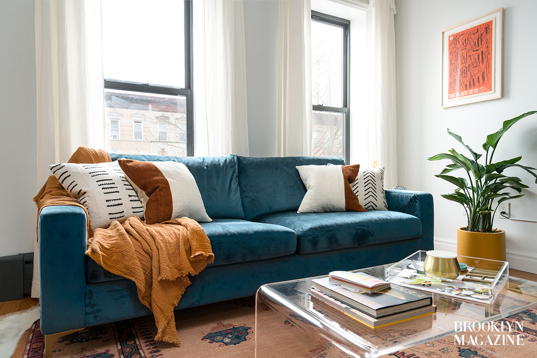
custom safari chairs by Third Life Designs; acrylic tray from JR William; vintage rug from House of Seance; floor planter + plant from The Sill


Molly and Harry’s Polaroid camera collection perches on their fireplace mantel, where they showcase photos of every visitor that they’ve hosted in the apartment. Custom polaroid holder by DK Vinyl Displays
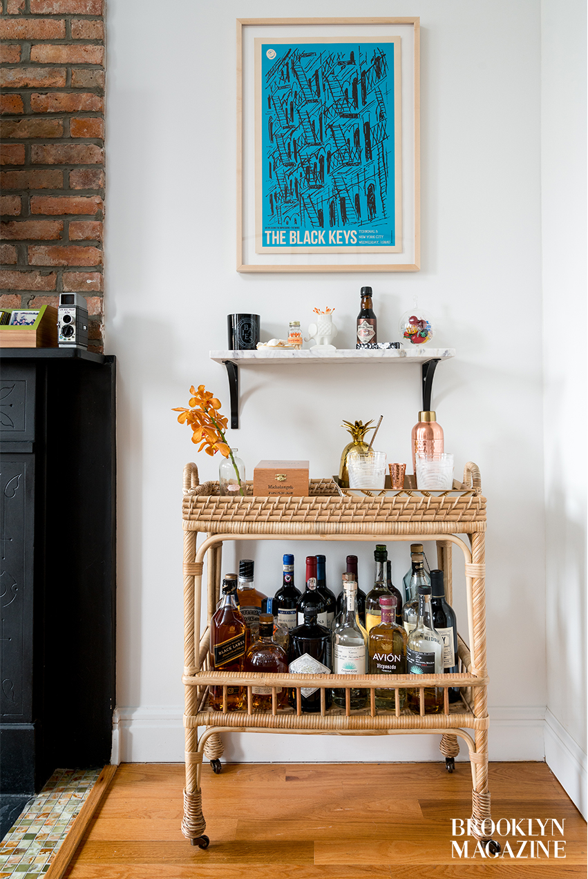

A bar cart full of the favorites. Bar cart from Serena & Lily; marble shelf & brackets from World Market; Black Keys poster frame from Simply Framed
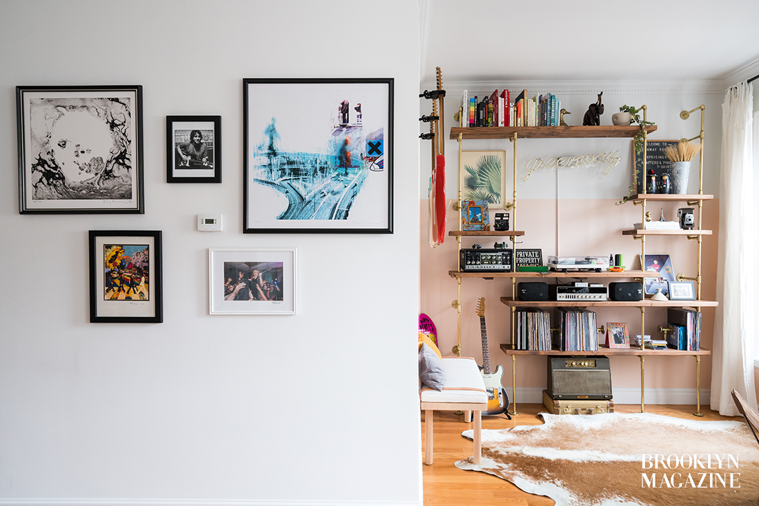

A small gallery wall frames the entryway to Harry’s music nook
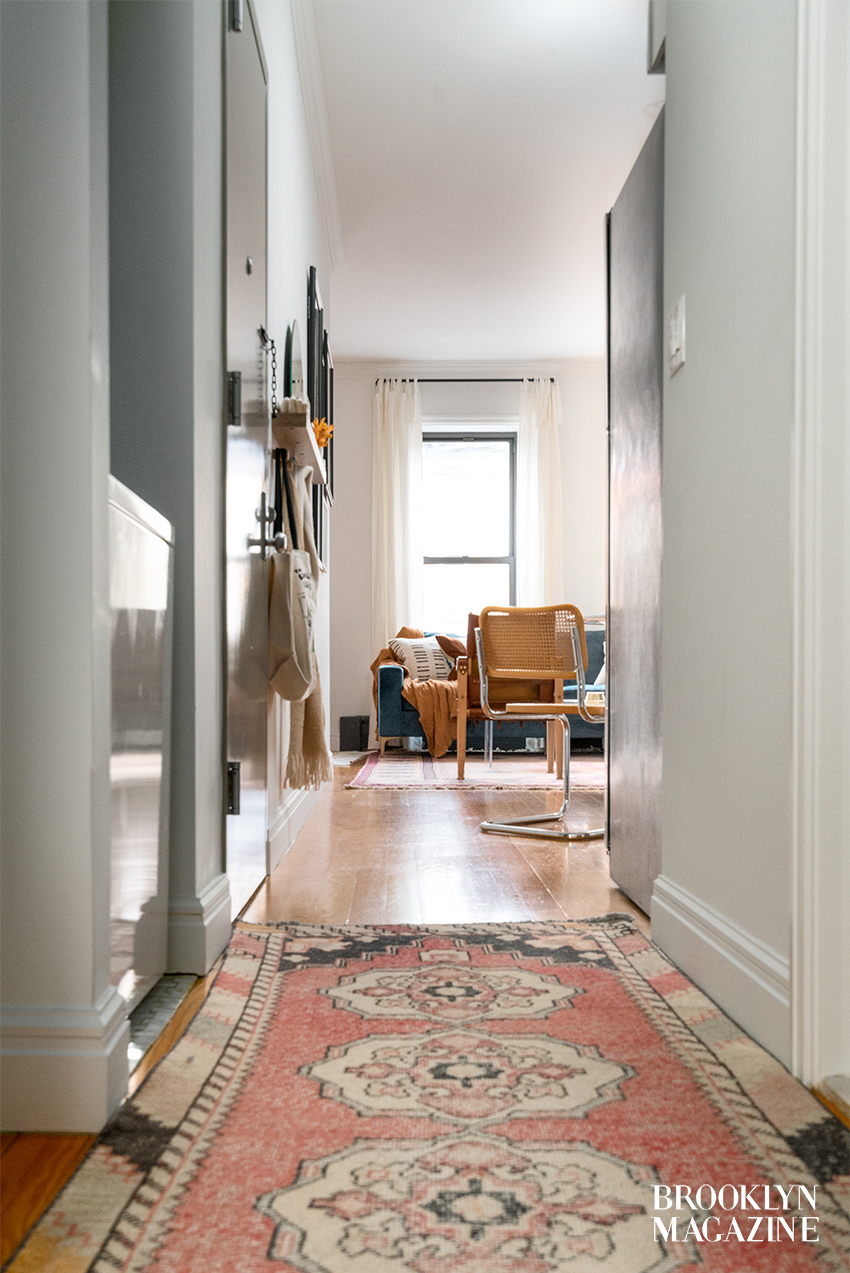

A hallway connects the bedroom and office with the open dining and living spaces. Rug from Revival Rugs
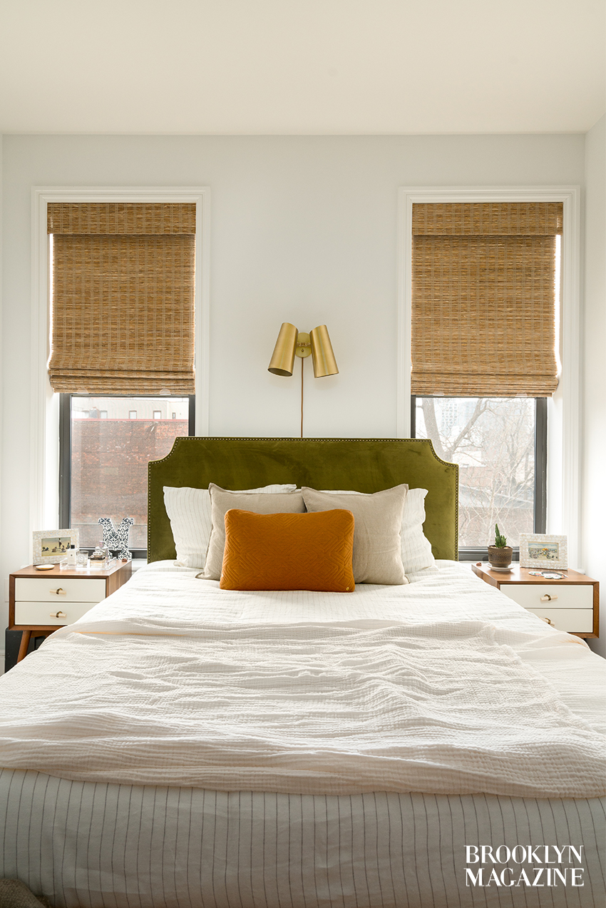

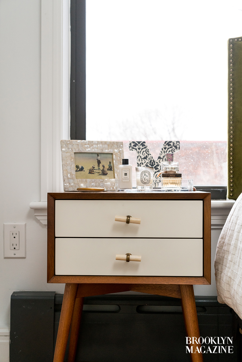
The cozy bedroom overlooks a back yard. Sconce from Rejuvenation; headboard from World Market; duvet cover set from Parachute x Jenny Kayne; throw pillow from Burke Decor; window treatments from Blinds.com
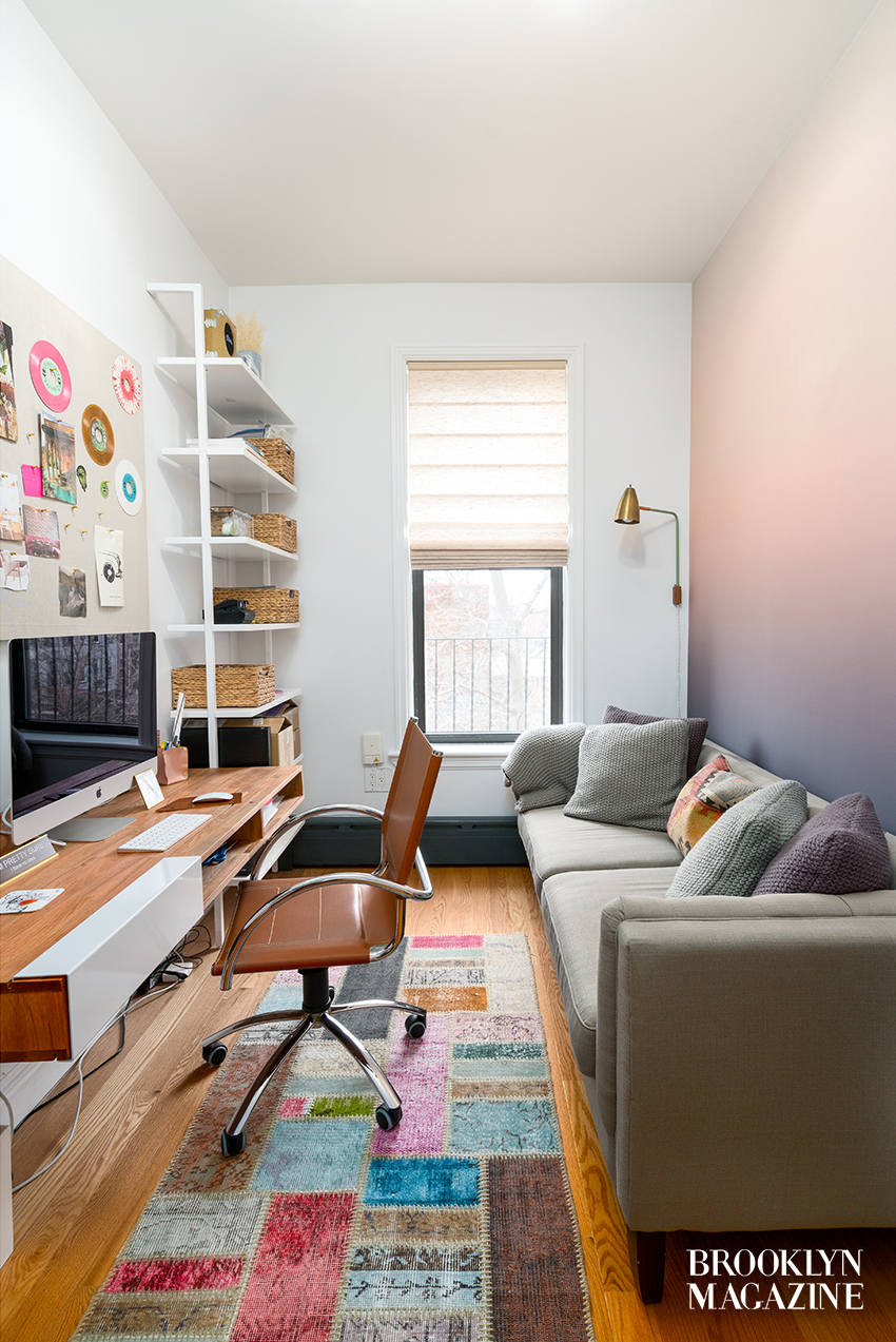

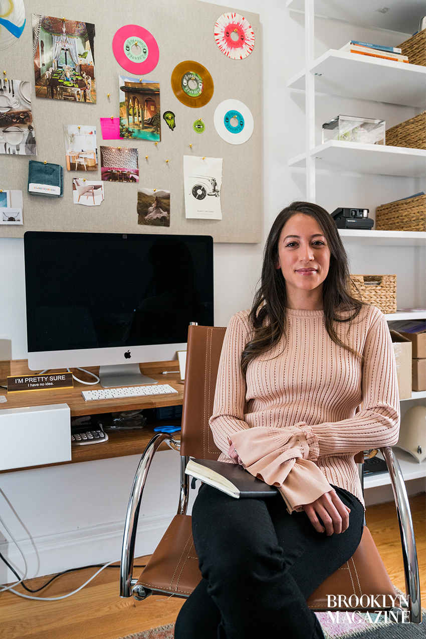
Molly works out of her soothing home office when she’s not out on meetings. Floating desk from LAXseries; sofa from World Market; bookshelves from CB2; custom sconce by One Forty Three; vinyl records from Greenway Records; custom temporary wallpaper by Murals Your Way; window treatments from Blinds.com

Follow Molly on Instagram @designingatinyempire
You might also like 


