Madelynn Ringo (Courtesy Ringo Studio)
Madelynn Ringo’s next act
The Glossier designer behind the 'Millennial Aesthetic' is moving away from the ubiquitous look she helped author
“It hit a stride, I’d say, sometime in the last six years,” says Madelynn Ringo. “It certainly came about from an interest in the millennial pink aesthetic.”
Ringo is referring to that speckled, pinkish marble terrazzo that’s taken over everything from coffee shops to dining rooms to trendy bathrooms. Funny enough, as she says this, Ringo is sitting in her coworking office space in Brooklyn, filled with wall-to-wall terrazzo countertops and plush pink velvet armchairs.
Nowhere is safe. You know the “Millennial Aesthetic” even if you’ve never heard of it: Brought to us by epoch-defining brands like Glossier and The Wing, the look has drenched an entire generation in pastel colors, squiggly mirrors and fiddle-leaf fig ferns. It’s in our homes, it’s on our feeds and most importantly, it describes where we shop.

The Glossier house Ringo built (Courtesy Ringo Studio)
Blame Ringo. From 2018 to 2020, she was the lead designer for Glossier and helped open its first retail stores in Miami, Seattle, London, Boston, Austin and Atlanta. At just 33 and with fire-red hair, porcelain skin and a knack for color, Ringo has helped define the look of a generation. But now, she is ready to move on. Even she is sick of terrazzo.
“We’ve definitely exhausted some of those trends,” she says. “I’m like, let’s find anything else. We’ve got to make the new version of this or decide what the new material is.”
Her latest project, a pop-up for the fast fashion brand Cider, is a big red apple come to life — complete with plush blue walls, undulating couches, and graphic color inspired by the artist Nicholas Party. For the store’s opening on November 4, she even got her nails done with 3D emblems to match the design of the space.
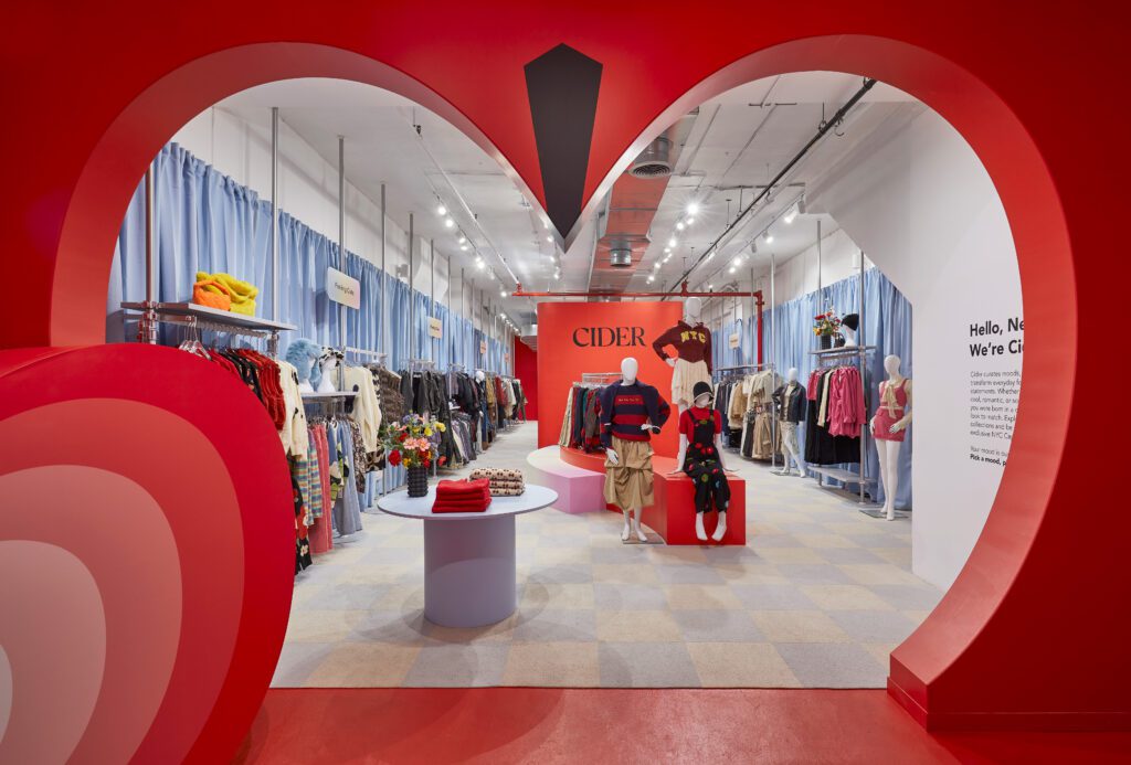

Cider in the Big Apple (Photo by Jody Kivort)
Ringo Studio, her design practice, has just launched its own Instagram account, debuted its own line of merch, and was subsequently featured as one of the Top 50 Architects and Designers of 2023 on Architect’s Newspaper. Now, just in time for Valentine’s Day, Ringo Studio will debut their space for Venus et Fleur, a brand that creates roses that last for a year, thanks to a special wax-dipping process.
It doesn’t hurt that Ringo is social media savvy in her own right. Last week she teamed up with popular New York-based TikTok and travel influencer Vicki Rutwind for a paid campaign highlighting the various different Ringo-designed brands around the city.
“These are the most instagrammable retail spaces in NYC…and they’re all designed by @madelynnringo of @ringostudiodesign,” Rutwind gushes over video of various retail spaces that look like something out of an outer-space fantasy. You’ve likely seen these backdrops in many an Instagram photo, but perhaps unaware they’re all connected to Ringo.


Ringo at home
From Bardstown to Brooklyn
Ringo grew up in Bardstown, Kentucky, “in a house where every single wall was a different color,” she says. She received her masters degree in architecture from Yale, and began her career as a designer for The Standard Hotels. She then went on to Glossier, designing stores in shades of “millennial pink” that became emblematic of a generation. The look became so ubiquitous it created enough haters who wish the look would finally go away.
Tara McCauley, a New York-based interior designer, describes the aesthetic over the phone as “blobby, pastel-colored pieces of furniture that are almost for babies.” At the beginning, it was sleek and unexpected — promising freedom from the noise of the outside world. But as more brands began to copy the look, it led to a formulaic sameness and started to feel bland.
“If you go to something like a Sephora now, where Glossier is carried, you can see how every brand just looks kind of like Glossier,” says Marisa Meltzer, author of a new book about the brand called “Glossy.” “There’s a lot of pink and pastels. There’s a lot of minimalist branding.”
At Glossier, Ringo cut her chops learning how to create a storefront as recognizable as a brand itself. Now, “stores have to work so much harder to bring people in when it’s easy enough to just buy things online,” says McCauley. “They need to create an experience. The store becomes a place for content creation.”
Crouched down in a corner of her coworking space, Ringo pulls material samples out of a high school-esque locker to show off color combinations for potential projects.
“When we work with clients, they might hire us for interior design,” she says, “but then we’re like, have you thought about the music? We should definitely have a scent in this space when somebody walks in. All of those things can be part of that overall experience.”
In 2022, Ringo designed a pop-up for Bala, an influencer-friendly millennial fitness brand known for their ankle weights that come in colors like sea foam green. The space felt like a boobly-joobly fantasy playground with rounded, exaggerated, oversized exercise equipment that doubled as seating with neon ‘80s-inspired lighting, and curvy mirrors primed for selfies.
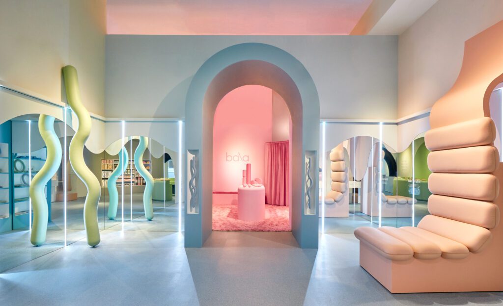

The Bala pop-up (Photo by Anna Morgowicz)
Also in 2022, Modern Age, a wellness and healthcare clinic in New York, opened looking like a chic luxury spa, replete with arched doorways and polished marble, giant marble columns and velvet curtains, accented by colors like pastel blue, lime green and peach.
More recently, Ringo designed the space for Contact Sports, a sex toy brand that opened its SoHo storefront last May in a way that is almost designed to deceive — the sexy shop at first glance looks like a retro high school locker room, with moody, dark interiors emblematic of a luxury clothing store.
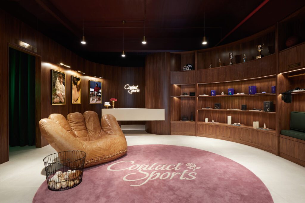

Contact Sports (Photo by Anna Morgowicz)
End of an era
The era of hyper-minimalist, “millennial” design seems to be on its way out. “It was never subversive or alternative. It felt sleek and corporate friendly,” says design writer Whitney Mallett, who calls the look “infantilizing and palliative … it’s too popular, too pervasive. There’s a sense that it’s all surface, that it’s not nourishing or lasting or quality. It’s like designing your house to look good for the screen, for a photo on your IG grid. It’s not buying heirloom furniture that you’ll pass down to your grandchildren.”
Other experts echo these sentiments. Michael Diaz Griffith, an antiques connoisseur and author of “The New Antiquarians,” says that “young people are interested in complex, contradictory aesthetics that borrow from history — throwback as well as futurist aesthetics.” Gen-Z’s emphasis on authenticity and their embrace of messiness seems to be in favor of a more unfiltered world — one that stands in stark contrast to the pristine, curated millennial aesthetic.
Even Glossier knows they must evolve. At their new SoHo store, which opened in February 2023, Pei-Ru Keh writes, what’s “noticeable is the brand’s subtle move away from the millennial pink shade it was strongly associated with, towards an embrace of shades like nude and blush instead.”
“I think it’s over,” Mallett agrees. “The vibes are so dominant now, they are no longer the fresh new voice.”
Which invites the question: what’s the new thing, then?
More colors, for one. “Darker, moodier spaces,” says Ringo. Her design for Contact Sports “was a very strong jump in our portfolio,” incorporating a more masculine and nostalgic aesthetic, with dark wood, mosaic floor tiles, and a rose shop in the front.
Gen Z seems less interested in following what’s come before and more interested in standing out. Ringo’s recent projects for brands such as Cider and Studs enveloped stores in bright shades of red and yellow respectively.
“I grew up with red hair, so I was inherently ‘colored’ in a very certain way,” she says. “I’ve always been drawn to color.”
But it’s not just start-ups where you’ll find Ringo’s next moves. “We are also also kicking off some exciting collaborations with heritage brands,” she teases. “Older brands looking for a big brand refresh to connect better with current customers.”
You might also like 


